Brand Portfolio and Identity Guidelines
Brand Guidelines Policy
This manual provides specific guidelines and standards to Wenzao University’s community for the implementation of the new visual identity system in all forms of the university’s communication. The guidelines have been developed by Wenzao University with advice and consultation from Wenzao University’s Management and team.
Since the power of a strong visual identity can only be realised through consistent application over time, it is the university’s policy that the official logotype, signatures, and marks as described in these pages are the only sanctioned marks for use across the school system. No other marks or symbols may be used in conjunction with or to replace the official Wenzao University visual identity system.
The Logo

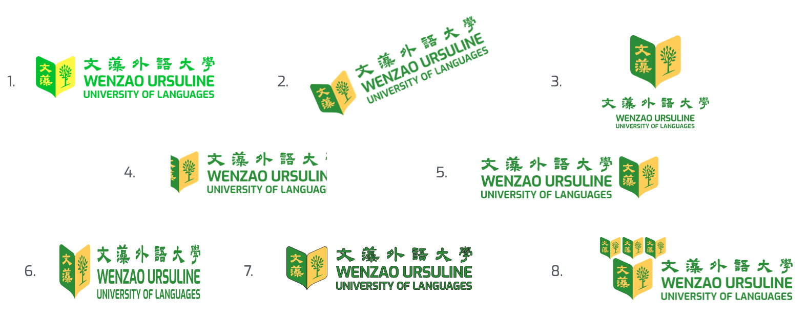
This is our primary logo.
Try to use this version at all times.

This version is only to be used when the primary version is not possible due to space or visibility constraints.
Logo Misuse
To ensure consistency, the logo should not be altered.
Always ensure when using any logo to:
- Do not alter the colours.
- Do not alter the orientation.
- Do not alter the proportions.
- Do not crop the logo.
- Do not alter the placement of the logo elements.
- Do not stretch the logo.
- Do not outline the logo.
- Do not add new elements to the logo.
Please note that this applies to all logo variations.

Colour Palette
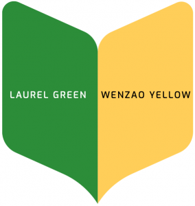
The colour palette should be used at all times to ensure consistency. Please note that black and white colours may be used as well when necessary.

Laurel Green
| RGB | 50, 141, 54 |
| CMYK | 80, 19, 100, 5 |
| HEX | #328D2E |
| Pantone® Coated | 7741 C |
| Pantone® Uncoated | 362 U |
Wenzao Yellow
| RGB | 255, 209, 73 |
| CMYK | 0, 19, 78, 0 |
| HEX | #FFD047 |
| Pantone® Coated | 1225 C |
| Pantone® Uncoated | 115 U |
Typography
The stated fonts should be used at all times to ensure consistency. The fonts consist of font Exo family for English text and Noto Sans Family for Chinese text.


